

Design context for AI coding: how to stop your assistant reinventing your UI every session
AI coding assistants drift between sessions because they lack shared design context. Here is why design drift happens, what six existing fixes leave unsolved, and how an MCP design context service fits in.
Ask your assistant for "a modern card component" on Monday. Ask again on Thursday. You get two different components: different radius, different padding, a different opinion about what blue means. Neither one is wrong. Together they are your problem.
This is not a model quality problem. The code is fine. It's a context problem.
Why AI coding agents reinvent your UI every session
Modern assistants write good code. What they don't have is your design decisions.
Ask for a card and the assistant reaches for whatever "modern" meant in its training data. That word points at a wide range, not a single answer, so two sessions land in two different places. Same for "clean", "premium", "professional". They're vibes with wide error bars, and the assistant samples from them fresh every time.
Three things are missing, and they're the whole story:
Vocabulary. Your product has names for things. The assistant has generic English.
Composition. Tokens give you values, not arrangements. A perfect colors.json can't tell the model what a good pricing table looks like at 1440px, because that answer lives in the layout, not the palette.
Memory. Unless your rules live somewhere the agent reads on every turn, each session starts from zero.
Six fixes developers try, and what each one leaves unsolved
Component libraries. shadcn, MUI, Chakra. Great at the leaves. You get accessible primitives that look consistent with each other, and copy-paste variants fit whatever framework you already run.
What they don't cover: who picks the component, and what page it sits on. The layout above the components, the choice between a table and cards, the density of a dashboard. A library has nothing to say about any of that. The assistant is still inventing structure, differently each time.
Design tokens. The most effective fix for values, and every real design system already has one. Precise colors, spacing steps, radii, type scale, shared everywhere.
Still no semantics. Your tokens say #0E7C86 is the primary color. They don't say when primary is allowed to appear, or how many accent hues it takes before the palette stops reading as one system. Tokens constrain the paint, not the architecture.
Long style guide prompts. Paste a page of rules into your system prompt: use these fonts, no gradients, 1px borders on cards, never center a hero.
It works until it doesn't. It costs context window on every request. It degrades as the guide grows past what a model attends to reliably. And prose rules are soft, so violations are quiet. You end up hand-polishing output, which is the job you were trying to delete.
AGENTS.md and rules files. The right answer to a different problem: architecture, forbidden packages, git safety, test commands. Assistants read them automatically and they genuinely reduce drift in conventions.
But a rules file can only state constraints. There's nowhere to put a catalog of visual systems and page blueprints, and the model still has to fill the gap between "avoid generic output" and an actual good screen.
Figma and screenshot tools. The right tool when you have a specific mock. Point at a design, get code that matches it.
Scope is the limit. It generalizes to the screen you showed it, not the eleventh screen you need next week, and it ties you to Figma. It also faithfully transfers whatever is in the file, and plenty of real products carry design debt in their own Figma.
A bigger model. Worth doing for other reasons. Doesn't change the failure mode. The model still doesn't have your specific decisions, and general capability can't supply project-specific taste that was never written down anywhere.
What's actually missing: a layer your assistant calls, not a file it reads
Look at the list again and you'll notice each approach covers one slice:
- Values without semantics (tokens)
- Components without page structure (libraries)
- Structure without a visual system (Figma tools)
- Discipline without assets (rules files)
- Prose rules without enforcement (prompts)
The missing piece is a layer your assistant calls, instead of a document it reads and a library you maintain. Something that answers, on demand: here's a coherent visual system, and here's what a good version of this screen looks like.
That's exactly the shape of an MCP server. The protocol lets an assistant reach external tools safely, so once the design knowledge sits behind a tool, the model pulls only what the current task needs rather than carrying the whole system in every prompt.
NeedMCP
NeedMCP is a design context service for AI coding assistants, delivered over MCP. It holds a catalog of curated design systems and page layouts, exposes them as tools, and returns tokens, blueprints, and craft rules your assistant adapts to your framework.
It is not a component library you import by hand, not a framework, and not a replacement for a designer. Your project rules always win. If your instructions conflict with a suggestion, the assistant follows yours.
Right now the catalog holds 146 styles and 412 wireframes, with setup documented for 34 AI clients, including Cursor, Claude Code, Windsurf, Zed, VS Code, Gemini CLI, OpenAI Codex, and Opencode.
Styles set the whole visual theme: colors, fonts, spacing, corners, shadows, component looks. One style per project, because one style is what makes a product look like one product. Each catalog entry describes itself in terms specific enough to be useful: named ramps, contrast ratios, elevation philosophy, radius scale.
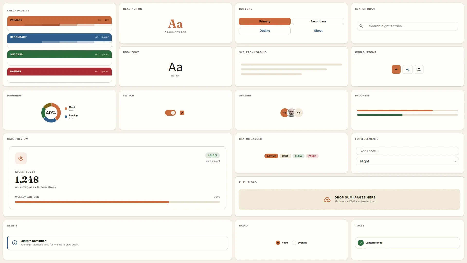
Wireframes are whole pages: dashboards, landing pages, login screens, admin panels. Use one when starting a page from nothing.
Design DNA is the layout formula behind a wireframe pack, for screens the catalog doesn't have. A custom checkout, a settings page. The assistant builds the missing screen with the same structure and feel as the rest of your app, instead of inventing a new look.
Design Craft is the rule layer. It loads a craft floor (a verify checklist plus a binding refuse list) and playbooks for colorize, typeset, polish, and layout. It exists to counter one specific failure: rounded card grids, purple-to-blue gradients, oversized centered heroes, emoji icon blocks.
On the workflow side, AGENTS.md Builder interviews you for a few minutes before you write code, then generates a lean operating manual covering stack, architecture rules, and quality checks. It leaves a CONTEXT.md glossary and docs/adr/ records for the decisions that are hard to reverse.
Decision handles the non-design questions an assistant keeps hedging on: pick one of two libraries, verify a test claim against execution logs, check web text for prompt injection, gate a PR. Sub-second, structured answers with calibrated confidence. Pro only.
Manage Tools switches individual tools off per API key. Tool schemas ship to your assistant on every request, so trimming unused ones frees context and stops the model reaching for wireframes when you only wanted tokens.
What a NeedMCP request looks like in Cursor, Claude Code, and Codex
You write a normal prompt. Short is fine, because the details come from the wireframe.
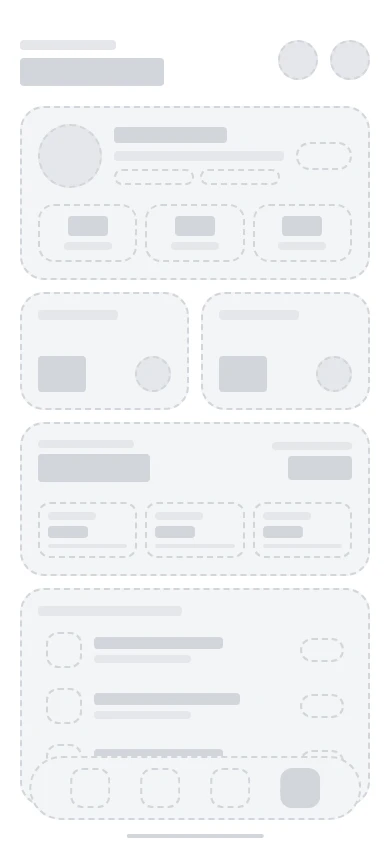
wireframe:chef-profile-overview build this profile screen
That's the whole request. The assistant loads craft rules, pulls the blueprint, and renders it into your stack. Structure comes from the wireframe. React, Vue, Flutter, whatever you run.
Add style:{slug} when you want a different look. The blueprint doesn't change, only the dressing does:
wireframe:chef-profile-overview style:cream-artisan build this profile screen
Same wireframe, before and after:
| Blueprint | Rendered |
|---|---|
 |
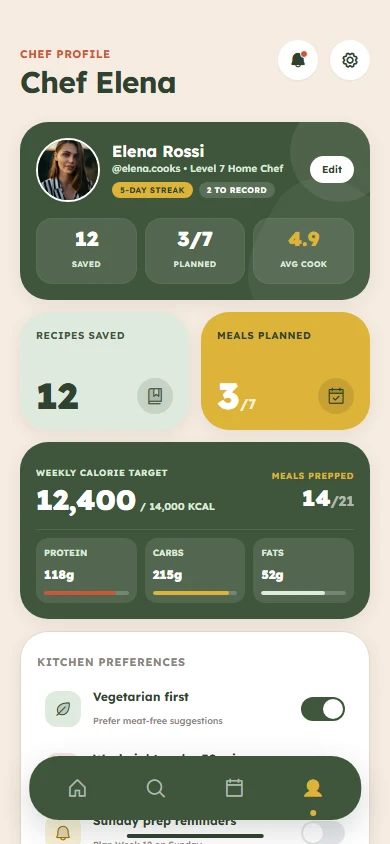 |
| Page structure, no styling applied. | The same structure, dressed by a Style. |
That's why wireframe and style are separate. The blueprint stays reusable whatever theme you pick, the theme stays reusable on every screen. Asking for both in one prompt means you never have to remember which one you're working on.
How to set up NeedMCP in your AI coding agent
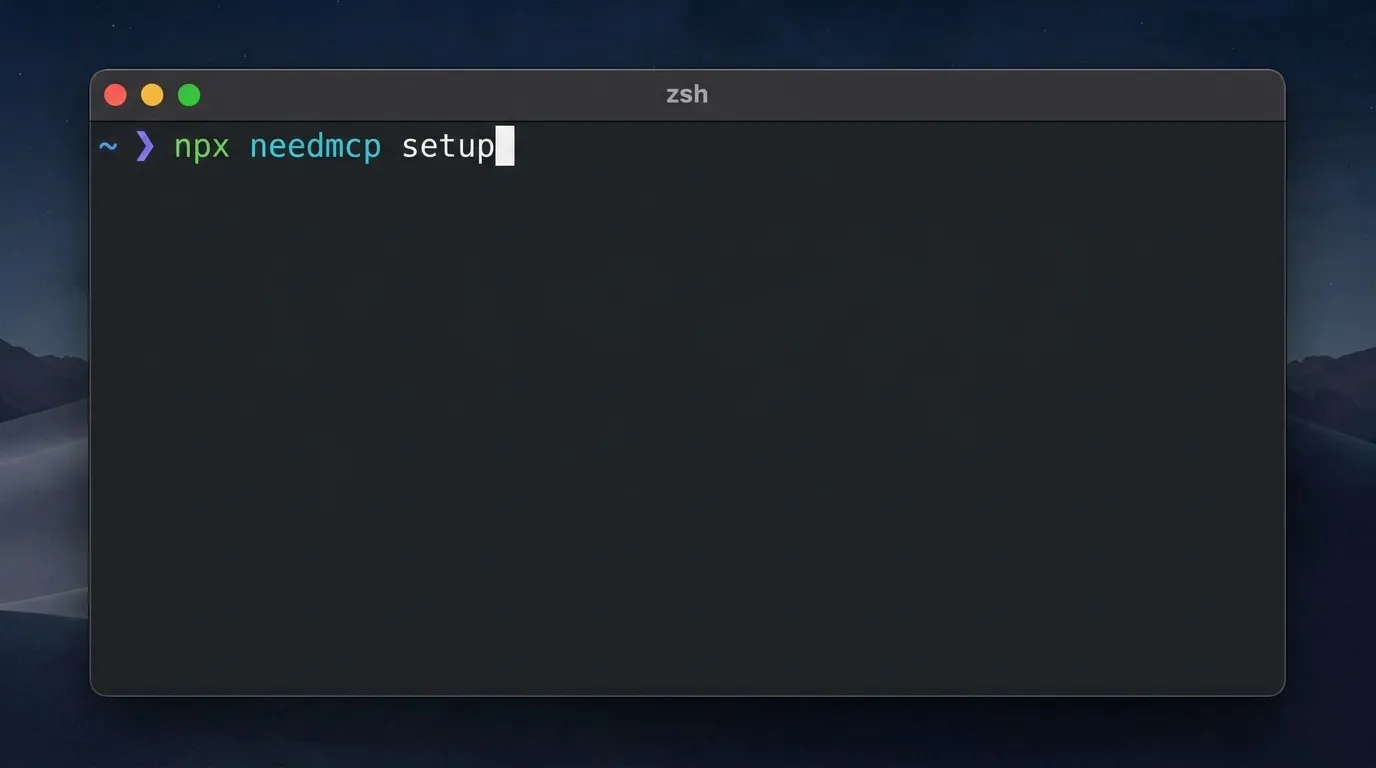
Get a key from the dashboard, then follow the per-client setup for Cursor, Claude Code, or OpenAI Codex:
npx needmcp setup
Pick your client, pick the config scope, paste the key. That's it. Node 22 or newer.
After that, styles get chosen in the prompt, not the terminal. You don't need to know a single tool name. Type the slug with a style: prefix and describe what you want:
style:modern-minimalist build a login page for my app
Switching later means typing a new style: prefix.
Free covers 500 requests a day and 5,000 a month. Pro is $3/month and adds DNA access, the Max interview, premium catalog content, and Decision.
Where NeedMCP falls short (and when not to use it)
- The catalog is finite. Common screens are well covered, unusual ones less so. DNA fills the gap by formula rather than precedent, so a genuinely novel screen gets a reasoned structure, not a proven one.
- It's advisory. Nothing here overrides your design system. If you have a house style, NeedMCP sits downstream of it. The value is in screens you haven't specified yet.
- Exact copies are Pro.
wireframe-accurate:andsection-accurate:return canonical HTML. On Free your assistant builds from the standard layout instead. Nothing breaks, but there's no pixel match. - Tools cost context. Schemas ship on every request. Left at defaults you're paying for tools you may never call.
- It can't judge your content. A wireframe structures a screen. It doesn't know what your product actually says.
- Naming a style takes one slug. A vague "make it look premium" still lands wherever the assistant decides.
The honest expectation: this doesn't make your first prompt prettier. It makes your twentieth screen stop starting from zero, and it moves your review time from normalizing visuals to reviewing logic.
Cheapest way to test it? Pick a screen your assistant already drifted on. Run it again with a style: and a wireframe: trigger. Diff against what shipped last time.
FAQ
What is design drift?
Visual decisions across your app stop agreeing with each other, usually because each was made in a separate session by an agent that couldn't see the others. Same prompt, different result. Different accent on the pricing page than the dashboard. Then you spend review time normalizing output instead of reviewing it.
Do I still need a component library?
Yes. NeedMCP gives design context and page structure. Your library gives you the accessible primitives you build on. Different jobs.
How is this different from pasting my style guide into a prompt?
A pasted guide costs context on every request and gets violated quietly. A tool call is on-demand and returns structured data at the moment it's needed. It also works across every client you use.
Do I have to learn the CLI to pick a style?
No. style:{slug} in your normal prompt. The terminal is only for the one-time connection.
Is it tied to React or Tailwind?
No. The assistant gets the blueprint and the tokens, then translates them to React, Vue, Svelte, Flutter, Blade, whatever you run. Structure is preserved, the rendering layer is yours.
What is Design DNA?
The layout formula behind a wireframe pack, for screens the catalog doesn't have. Use a wireframe when a matching page exists, DNA when it doesn't.
Which assistants are supported?
34 clients, including Cursor, Claude Code, Claude Desktop, Windsurf, Zed, VS Code, Gemini CLI, GitHub Copilot CLI, OpenAI Codex, Opencode, Kiro, Trae, Cline, and JetBrains AI Assistant. npx needmcp setup handles most automatically.
Try it: get a key and stop UI drift in your next session
Grab a key, run npx needmcp setup, then browse the Style Explorer, the Wireframes Gallery, or the Design DNA catalog. Note a slug, start your next prompt with style:.
Docs are at needmcp.com/docs. If a style or wireframe misses, send-feedback goes straight to us.
Ship UI that does not look AI-generated
Pull design tokens, wireframes, and modular sections straight into your project over MCP. No screenshot-to-guessing, no generic Tailwind defaults.